What MKG, HUGE and 99U Have In Common With Mother’s Day
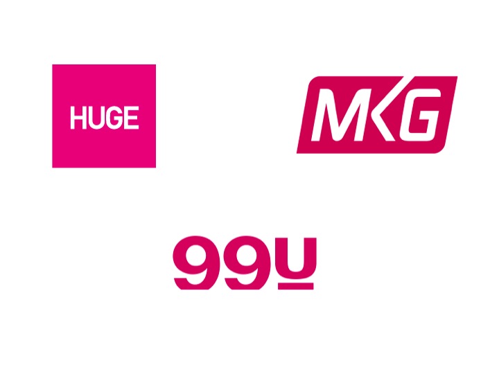
Scrolling through my Twitter feed I noticed the logo of a few brands used the color pink. What struck me the most was that all three were in similar industries; two are digital agencies, MKG and HUGE, and the third is a brand beloved by creative freelancers for their practical advice on how to make ideas into reality, 99 U of Behance. What better time to dissect the color pink associated with femininity than on Mother’s Day?
 pink
pink
feminine
compassion
romantic love
inspiring
comforting
“suggesting hope for the future”
“calms, and reassures our emotional energies alleviating feelings of anger, aggression, resentment, abandonment and neglect”
When we think of femininity we should start thinking of it as the beginning of creativity. A feminine quality is to nurture. We’re so used to the idea of judging femininity by its ability to physically nurture let’s take the idea of nurturing and apply it to ideas as well. Like a mother who swoons over her macaroni necklace, family portraits that resemble blobs, our mothers are our biggest cheerleaders, nurturing our dreams and ideas.
To step away from the “girly” attributes of pink all of the brands used a darker shade which has more of an edge than a lighter shade.
No color can stand on its own so the brands also use white for their logos, and further in their website designs, black as well to balance the pink.
If these brands are any testament, (mainly dark) pink represents the ideas and the creativity befitting of the marketing, advertising and creative industries in the new digital age. To reiterate an idea that isn’t new, ideas are the new currency.
I’m not sure if this is what the respective companies were shooting for, but I’m going to draw my conclusions anyway because color is another form of symbolism.
Here’s to all the mother’s who believed in our dreams, even before we did.
More From This Issue
Evolution Of A Creative Entrepreneur- Brooklyn Kolache Co.


Submit a Comment